Making Flyers |
April 8th, 2016 |
| design |
 |
 |
 |
 |
 |
 |
They're not as good as ones a graphic design professional would create, but they're much nicer than what you can make in Word. The key thing is to use a program that actually lets you align things accurately, and the best free one I know is Inkscape.

Inkscape is a powerful tool, and it does take some time to learn how to use it well. Depending on how you learn, you could try following online tutorials, either text or video, or just playing around with it, which is how I learned it.

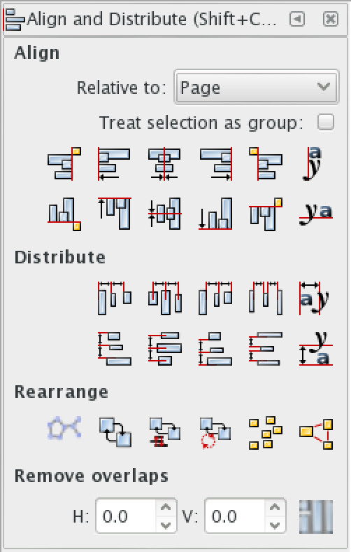
However you go, a really key collection of settings are under
"Object > Align and Distribute". This is what lets you line
things up with other things exactly, instead of by eye, which really
makes a difference in getting a good layout. Try out each of the
different ways of aligning, and each of the things you can align
relative to.
As you make flyers, a big thing to consider is how they look from a distance. Zoom way out and make sure they key things you want to communicate are visible. This is what is going to draw people in to take a closer look. Specifics like addresses and emails can be smaller, but don't make anything too small.
A lot of making attractive flyers is about learning what looks good, developing an eye. The better your eye is, the more you can look at something you're working on and say "that's not quite right," even if you don't yet know exactly the right way to fix it. Pay attention to other flyers, try to figure out the differences between ones that look professional and ones that look homemade. Especially consider flyers that convinced you to go to something, though of course you can't attribute that even mostly to the flyer.
Mostly, get a lot of practice by making as many as you can, training your eye and learning how to use your tools.
[1] They're not as important as they used to be, now that there are
websites, Facebook, Meetup, and domain-specific search engines, but
there are still a lot of people that are best reached via flyers.
Comment via: google plus, facebook