GWWC Reporting Attrition Visualization |
April 19th, 2023 |
| ea, gwwc |
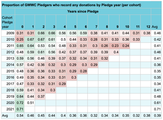
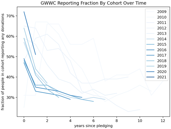
This is interesting data, but I found it a bit hard to think about. I tried a few ways of visualizing it, and made a pair of charts:
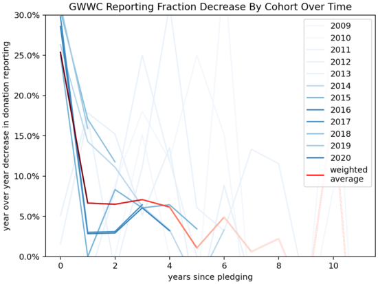
I colored each line with an intensity proportional to the number of people in the cohort, since that represents how much information it represents. The weighted average line fades out over time as it represents progressively fewer members.
Some thoughts, looking at the charts:
Later cohorts, starting around 2015, fall off faster than earlier cohorts.
Reporting attrition is quite sharp at first, and then slows down, but it doesn't go to zero.
After the initial attrition it seems to end up around 2-6% annually, though this depends a lot on where you see "initial attrition" ending.
There's probably some sort of effect of the calendar year ("how hard did GWWC push people to report donations") and I haven't looked at this.
Disclosure: my wife used to be President of GWWC. I haven't run this post by her and I don't know her views here. I shared a draft of with GWWC before posting.
Comment via: facebook, lesswrong, the EA Forum, mastodon, substack


